ShopDreamUp AI ArtDreamUp
Deviation Actions


Suggested Deviants


Suggested Collections


You Might Like…


Description
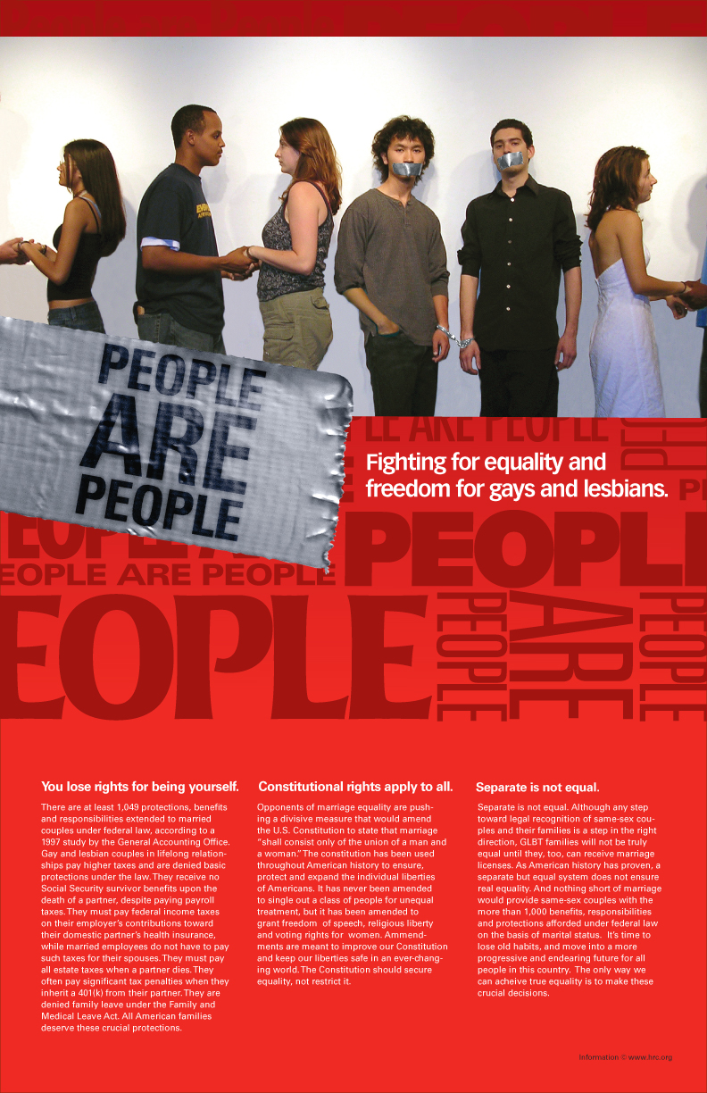
Type_1 Final Project - Gay/Lesbian Rights Poster
CONCEPT:
All visual messages have a hierarchical order to the information presented - an order of reading the information that corresponds to an order of importance. In typographic design, a grid system is an essential method for organizing text on a page and amplifying its meaning. Keeping in mind the basic design elements: Contrast, Repition, Alignment, and Proximity, a designer can use a grid system to build a framework in which visual and typographic elements work to successfully express content. You and a partner will create a poster that expresses a hierarchal order of content/typography and which uses a grid to organize said content. The poster will contain primarily typography, but may also contain supporting images/illustrations.
PROCESS:
My partner Kisha and I were killing ourselves with ideas for this thing. We had issues that we both cared about such as Racism, Civil Equality, and Student rights, but we couldn't quite put our finger on what we wanted. One thing was for sure, we weren't going to do some poster for a concert or something. We wanted to do something to turn heads, or at least make people think, even for a second. After MUCH idea throwing, we ended up picking Gay/Lesbian Rights. I've personally taken this issue on in other mediums, and her being a lesbian really carried the thought process along in ways I would not have been able to venture. We had ideas from "A guy and girl doll on the top of a wedding cake, with another guy doll forcefully pushed aside", to "Two boy children being scolded by the ever loving parent (America) for being themselves". Each of our ideas had their own flavor, but there was definitely an "impact" that we were missing. We were struggling for awhile into it, as other people were strolling along with their "normal" posters (Fruit Juices, Cars, Tech Expo.) A classmate saw this, and jokingly suggested we just try to show just a bunch of people all looking the same, but not. After hearing this, my mind just went crazy thinking of different combinations of that idea, and the current idea ultimately came through. (Erin, if you ever see this, THANK YOU) As soon as I had the idea pinned, Kisha and I started on our first photo shoot for the thing. It took 3 seperate photo shoots, and some clever photoshopping (by me) before we were both satisfied.(Photo shoot Highlights: [link])
As far as design, we had done layout desgns since the beginning of the project, and just picked one that went best with the idea, and edited that around it. The duct tape logo, was an idea I had while trying to keep the drama of the situation relevant to the poster itself. I wanted to be able to visually tie the photo and the vector graphics together, and I think it worked nicely. The text background is me trailing the eye around and really pushing the "People are People" without preaching, by the use of color.
PHOTO EXPLANATION:
The idea here is pretty simple. In the photo, the heterosexual couples are holding hands, and rightfully so, since they belong together, and they love each other. The homosexual couple, however, has only the option of being together by the legal boundaries of laws that were going to be made.(The ammendment got overturned, Thankfully) Basically, the only way they could possibly "be together" is if they don't do anything that the other couples can, and shut up about it, hence the Handcuffs and Duct Tape. The handcuffs are technically bonding them together, but through a negative connotation that criminalizes them for doing nothing more than being themselves. They want to touch, as the other couples, but the government doesn't want them holding hands, and handcuffs are their only option. The Duct tape...well...shuts them up.
A big thanks to all the people that participated in the shoots. I know I'm a difficult person to work with, and I appreciate you dealing with me poking, pushing, and ordering you guys around.
All in All, I think it came out great, and I hope I can get to work again with Kisha sometime in the future.
Completion Time: 30 or so hours, including Photo Shoots
Image size
792x1224px 853.55 KB
© 2004 - 2024 organicjerk
Comments25
Join the community to add your comment. Already a deviant? Log In
Browsing the site again...and came across this. STILL fucking relevant. Goddamn.